Prompt library

Prompts that work

Ready-made prompts for ads, logos, posters, 3D and more. Use one in a tap — or share your own.

+ Add a prompt
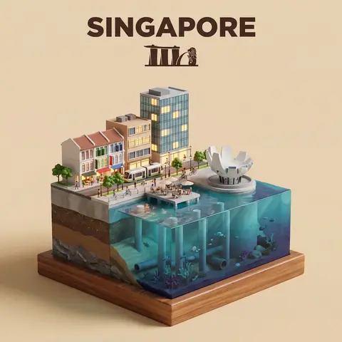
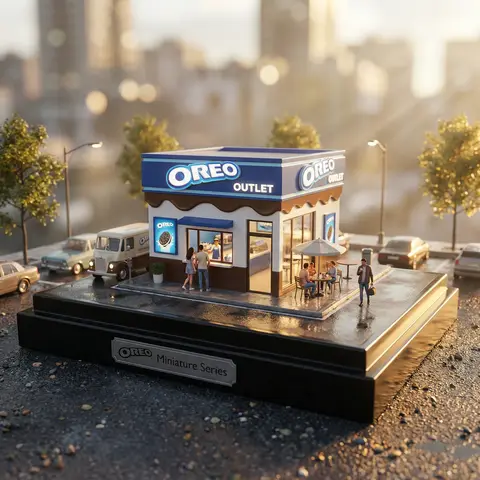
Waterfront City Cross-Section Diorama
3DPhoto

Waterfront City Cross-Section Diorama

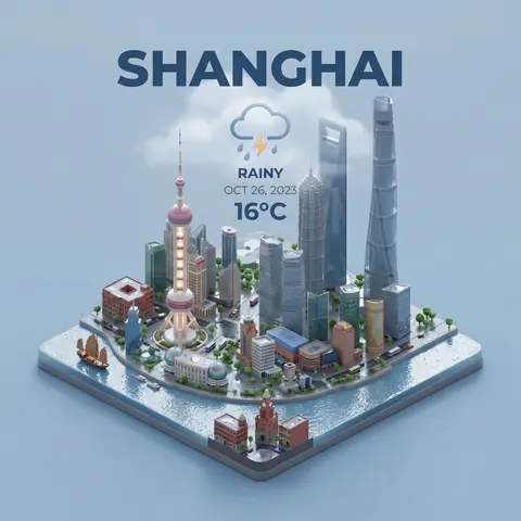
Present a clear, side-facing isometric miniature 3D cartoon diorama of CITY along the WATERFRONT. The scene is a clean vertical cross-section slice — the city is cut open like a museum specimen, mounted on a small raised diorama-style base that exposes the full stratigraphy from rooftop to riverbed. Above the waterline: a curated selection of CITYs most iconic waterfront elements — layered building facades in local architectural style, embankment promenade, bridges, trams or cyclists, warm soft ambient lighting. Tiny stylized figures of residents in casual attire — walking, cycling, sitting at waterfront cafés (no facial details). The water surface is a clean glassy horizontal band — cartoon-stylized, slightly transparent, acting as the visual threshold between the two worlds. Below the waterline: the geographically honest submerged anatomy of CITYs WATERFRONT — accurate foundation and piling types, real underwater infrastructure, sediment and substrate layers appropriate to this specific body of water, local aquatic life rendered in the same soft cartoon style. Tiny stylized fish, slow-drifting particulate, refracted light shafts filtering down from the surface. The cross-section cut edge is razor-clean — pavement strata, foundations, soil layers, and underwater geology all simultaneously visible in the base wall, like a natural history diorama exhibit. Style: soft refined textures, realistic PBR materials, immersive ambient lighting. Color language: warm amber and golden tones above the waterline, cold teal-green and deep indigo below, blending at the water threshold. Ultra-clean, high-clarity 3D cartoon diorama aesthetic. Use a clean solid BACKGROUND COLOR background. At the top-center, display CITY in large bold text, and place the waterfront name or a city landmark silhouette emblem below the text. All text must automatically match background contrast.

durs.ai
Mixed-Media Brand Campaign Art Direction
PosterPhoto

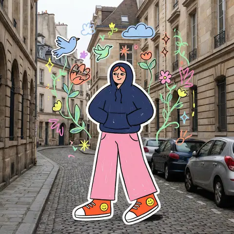
Mixed-Media Brand Campaign Art Direction

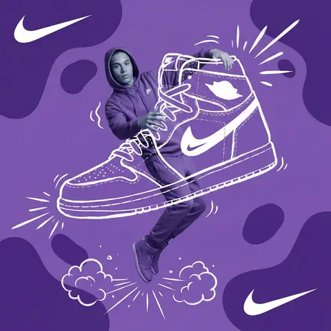
Act as a Mixed-Media Campaign Art Director. Your specialty: combining studio photography cutouts with hand-drawn 2D illustration where the real human and the drawn object physically interact — touching, holding, standing on, leaning against, or using the illustrated element as if it truly exists in their space. PHASE 1: CANVAS & COLOR SYSTEM Format: 1:1 square canvas. Base: single flat saturated color HERO COLOR. No gradients. No texture. Pure chromatic field. Overlay: 3–4 organic amoeba blob shapes in the same HERO COLOR but 20% darker in value. Smooth edges, irregular silhouettes, scattered asymmetrically. Some bleeding off-frame. Hand-painted feel, clean execution. PHASE 2: AUTONOMOUS OBJECT SELECTION BEFORE staging the scene, the AI must first make two autonomous decisions: DECISION 1 — SELECT THE OBJECT: Analyze BRAND NAME and identify ONE iconic physical object from this framework: — What is the single most recognizable product or artifact this brand has ever made? — What object do fans of this brand collect, use daily, or photograph? — What prop has defined this brands visual identity across decades? Do NOT choose animals. Do NOT choose logos. Choose a real, large, tangible object that can physically occupy space next to a person. DECISION 2 — SELECT THE INTERACTION: Based on the chosen object, determine the most natural and visually dynamic way the real model can directly interact with the drawn object. Interaction must be: ✓ Physical and direct — hands touching, feet on, body leaning, arms around ✓ Immediately readable — the relationship between person and object is understood in under 2 seconds ✓ Scaled correctly — the object must be large enough to interact with at human scale ✓ Active, not passive — the model is DOING something with the object, not just standing next to it INTERACTION TYPE EXAMPLES (AI selects the most brand-appropriate): · HOLDING: models real hands grip the illustrated object — cup, camera, trophy, bottle, bag · WEARING/USING: models real body wears or uses the object — sitting on a chair, wearing an illustrated hat, holding an illustrated product to their face · STANDING ON: models real feet are planted on top of the illustrated object — skateboard, surfboard, podium, giant sneaker · RIDING/LEANING: models real body leans against or drapes over the illustrated object — car hood, shopping cart, giant product silhouette · EMERGING FROM: model appears to step out of or through the illustrated object — bursting through a giant sneaker box, rising from an illustrated cup PHASE 3: STAGING THE SCENE Once object and interaction are selected, stage the full scene: MODEL: Single model age 18–26, clean cutout, zero fringing. Pose is determined by the chosen interaction — the body position must make the interaction feel natural and physically believable. Wardrobe: BRAND NAMEs most iconic apparel in HERO COLOR monochromatic palette. ILLUSTRATED OBJECT: Pure white (#FFFFFF) flat 2D illustration. Brush-pen marker line quality, 3–5px weight. Slightly imperfect organic edges — hand-drawn feel, not vector-perfect. NO shading. NO gradients. Flat white fill only. SCALE RULE — CRITICAL: The illustrated object must be LARGE. Minimum size: 40% of canvas height. The object should feel monumental — oversized relative to real-world scale is acceptable and encouraged. A coffee cup can be waist-height. A sneaker can be as tall as the model. Large scale = better readability = stronger visual impact. DEPTH LAYERING — CRITICAL:The object must exist on multiple z-layers: — Parts of the object sit BEHIND the model — Parts of the object come IN FRONT of the model — The models real hands/feet make contact at the intersection point This layering is what makes the scene feel integrated rather than collaged. BRAND STAMP: One small BRAND NAME logo mark appears on the objects surface — naturally embedded as if printed, engraved, or stitched. Rendered in HERO COLOR darker variant. Subtle, not dominant. PHASE 4: SUPPORTING ILLUSTRATION SYSTEM All supporting elements: white, flat, brush-pen line style. Same visual language as the hero object. LOGO MARKS: BRAND NAME primary icon in white: — Large (upper-left corner, ~15% canvas width) — Medium (opposite corner, ~10% canvas width) IMPACT MARKERS: 2–3 manga-style exclamation dash clusters near the point of interaction between model and object — where hands grip, where feet land, where bodies touch. This emphasizes the physical connection. MOTION LINES: 2–4 curved speed lines radiating from the object or the models most active body part. Taper at ends. Cross behind and in front of the model for depth. GROUND EFFECT: At the base of the scene: white illustrated ground interaction — sparkle stars, short speed dashes, or object-specific effect (splash if cup, dust clouds if sneaker landing, wheel tracks if skateboard). AMBIENT SQUIGGLES: 1–2 loose organic white lines floating near the models torso — visual rhythm connecting the photographic and illustrated layers. PHASE 5: LIGHTING Studio strobe, high-key, even and clean. 5500K neutral. No dramatic shadows on model. Soft contact shadow at models feet (opacity 15%). The photography reads as natural and real against the graphic illustrated environment. TECH SPECS Aesthetic: mixed media — real photograph integrated with hand-drawn 2D illustration. Color count: 3 maximum — HERO COLOR light, HERO COLOR dark blobs, white illustration. Photography skin tones and fabric colors are the only additional color exception. Illustration style: Y2K comic energy, Japanese streetwear magazine, brush marker. Composition: asymmetric and dynamic. The interaction point between model and object is the visual center of gravity — everything else orbits around it. No text. No wordmarks. Logo icon only. Mood: the model is not posing WITH the object — the model is IN THE MIDDLE of using it. Caught mid-action. Alive.

durs.ai
Luxury Brand Product Key Visual
PosterPhoto

Luxury Brand Product Key Visual

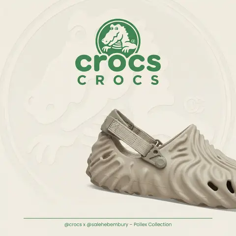
BRAND NAME + PRODUCT Act as a Senior Luxury Fashion Art Director and Studio Photographer specializing in high-end product key visuals for flagship campaigns, e-commerce editorials, and mobile-first brand content. PHASE 1: FORMAT & CANVAS Vertical format, 9:16 aspect ratio. Canvas background: a single flat field of warm off-white — not pure white, not grey. Target tone: soft ivory cream (#F4EFE6 equivalent), uniform and completely shadowless across the entire background plane. Autonomously determine BRAND NAMEs signature background tone — if the brand has a recognized house color for its packaging, tissue paper, or lookbook backgrounds, shift the canvas toward that specific off-white or neutral. The result must feel like an official brand document, not a generic studio. PHASE 2: BACKGROUND PATTERN (WATERMARK LAYER) Autonomously identify BRAND NAMEs iconic surface pattern, monogram, or archival motif — examples: a house monogram, toile print, geometric logo repeat, heritage emblem, or signature textile pattern. Render this pattern across the entire background canvas as a ghost watermark: same tone as the background but with a slight value shift (approximately 8–12% darker or lighter than the base). The pattern must be large in scale — individual motifs spanning 15–25% of canvas width. Opacity: 10–18% maximum. No hard edges. The pattern should feel embossed or tone-on-tone woven, not printed. It must recede behind all other elements. PHASE 3: LOGO PLACEMENT Autonomously reproduce BRAND NAMEs official logo with complete fidelity — correct letterforms, proportions, secondary marks (emblems, crowns, stars, monogram icons). Place the logo centered horizontally in the upper third of the frame (top 30% of canvas). Scale: the logo should span approximately 40–50% of canvas width — prominent but not overwhelming. Logo rendering: flat 2D, no extrusion, no chrome. Color: autonomously apply BRAND NAMEs official logo colorway — the exact brand-standard color(s) used on official packaging and website. If the brand uses a two-tone logo (icon + wordmark in different colors), preserve that hierarchy precisely. Directly below the main logo mark, place the full BRAND NAME wordmark in spaced capital letters — clean, geometric sans-serif, tracking: +200 to +300, same brand color, optical size approximately 60% of logo height. No decorative elements between logo and wordmark. PHASE 4: PRODUCT PLACEMENT Render PRODUCT as a photorealistic studio object with maximum material fidelity: — Leather: visible grain, pore structure, stitching thread texture, realistic edge paint. — Hardware: gold or silver metal with micro-reflections, not flat. — Canvas/fabric: woven fiber detail, not smooth CG. — All brand-specific surface patterns on the product must be accurate and legible. Placement: the product enters the frame from the bottom-right corner at a natural 25–35 degree angle, as if casually placed or mid-motion. The product is cropped — only 60–75% of the object is visible within the frame. The crop should feel intentional and editorial, not accidental. The product occupies the lower 55–65% of the canvas. The product must feel physically present in the space — not floating. Cast an extremely soft, barely visible contact shadow (opacity 8–12%) on the canvas beneath the nearest edge. No hard drop shadows. PHASE 5: LIGHTING Lighting: simulated large north-facing studio window light. Soft, directional, shadowless on the background. Color temperature: 5500–6000K (neutral daylight, slightly cool). Key light: large softbox equivalent from upper-left, filling the entire product surface evenly with minimal contrast ratio (1.2:1 to 1.5:1 max). Fill light: large bounce from right side, eliminating all harsh shadows. No rim light. No dramatic contrast. The lighting philosophy is: the product sells itself — light only reveals, never performs. Global Illumination enabled for subtle inter-reflections between product surfaces. No specular hotspots on leather — only on metal hardware. PHASE 6: TYPOGRAPHY & FINISHING Bottom of frame: a thin horizontal rule line (1px, brand color, 80% canvas width, centered). Below the rule: a single line of micro-copy — a social handle, collection name, or campaign label — in the same clean sans-serif, lowercase or small-caps, minimal tracking. Autonomously generate a contextually appropriate label for BRAND NAME. TECH SPECS Render engine: photorealistic CGI, Keyshot / Octane product visualization aesthetic. Resolution: 9:16, ultra-high detail. Depth of Field: f/16 equivalent — everything in sharp focus. Zero bokeh. Tack-sharp edges on all product details.Tone mapping: clean, true-to-life. No filmic crush. No vignette. No grain. Color grade: neutral, faithful to real product color. Slight warmth in the ivory background only. No AI-plastic normals on leather or fabric. Microscopic surface imperfection maps required. No reflections on background. No environmental reflections — studio only. Mood reference: Louis Vuitton / Bottega Veneta / Celine official e-commerce and campaign photography standard. Clean enough to be used as a press image.

durs.ai
VIRALMEDIA AI Agency Dark Landing Page
BrandingPhoto

VIRALMEDIA AI Agency Dark Landing Page

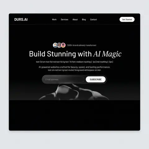
Build a dark-themed, single-page landing page for an AI web design agency called VIRALMEDIA. The design uses a pure black background (#000) with white text, a signature liquid glass glassmorphism effect, and two Google Fonts: Barlow (body/UI) and Instrument Serif (italic accent text). Use React, Tailwind CSS, Framer Motion, and hls.js. All buttons are rounded-full. DESIGN SYSTEM (index.css) Color tokens (all HSL, dark-only — no light mode): --background: 0 0% 0% (pure black) --foreground: 0 0% 100% (pure white) --card: 0 0% 9%, --card-foreground: 0 0% 100% --primary: 0 0% 97%, --primary-foreground: 0 0% 9% --secondary: 0 0% 15%, --secondary-foreground: 0 0% 100% --muted: 0 0% 15%, --muted-foreground: 0 0% 75% --accent: 0 0% 15%, --accent-foreground: 0 0% 100% --border: 0 0% 20%, --input: 0 0% 20%, --ring: 0 0% 100% --radius: 2px --font-body: Barlow, sans-serif --font-accent: Instrument Serif, serif Liquid Glass CSS classes: .liquid-glass — subtle glassmorphism: background: rgba(255,255,255,0.01), background-blend-mode: luminosity, backdrop-filter: blur(4px), no border, box-shadow: inset 0 1px 1px rgba(255,255,255,0.1). Has a ::before pseudo-element for a gradient border effect using linear-gradient(180deg, rgba(255,255,255,0.45) 0%, rgba(255,255,255,0.15) 20%, transparent 40%, transparent 60%, rgba(255,255,255,0.15) 80%, rgba(255,255,255,0.45) 100%) with mask-composite: exclude and padding: 1.4px. .liquid-glass-strong — stronger variant: same as above but backdrop-filter: blur(50px), box-shadow: 4px 4px 4px rgba(0,0,0,0.05), inset 0 1px 1px rgba(255,255,255,0.15), and slightly higher gradient opacity values (0.5/0.2 instead of 0.45/0.15). Tailwind config: Set fontFamily: body: Barlow, sans-serif, accent: Instrument Serif, serif at the theme root level (not in extend). SECTION 1: NAVBAR (fixed) Fixed top, full-width, z-50, px-8 py-6, flex row with space-between Left: Logo text VIRALMEDIA — text-xl font-semibold tracking-tight font-body text-foreground Center (hidden on mobile): Nav links Work, Services, About, Blog, Contact — each px-4 py-2 text-sm font-medium text-foreground rounded-sm hover:bg-white/10 Right: Get Started button — liquid-glass-strong rounded-full px-6 py-2.5 text-sm font-medium text-foreground SECTION 2: HERO (full viewport height) Container: relative w-full h-screen overflow-hidden Background video (behind everything): Absolutely positioned, object-cover object-bottom. On mobile: -translate-y-100px, on md+: no translate. Video URL: https://d8j0ntlcm91z4.cloudfront.net/user_38xzZboKViGWJOttwIXH07lWA1P/hf_20260326_073936_8dd07fdb-4f6b-4220-a3f0-9dedfaab0c88.mp4 (autoPlay, loop, muted, playsInline) Bottom gradient overlay: absolute inset-x-0 bottom-0 h-60 bg-gradient-to-t from-background to-transparent Content (z-10, flex column, justify-end, pb-10 md:pb-20): Avatar row: 3 overlapping circular avatars (http://pravatar.cc, w-8 h-8 rounded-full border-2 border-background, -space-x-2) + text 7,000+ brands already transformed in text-muted-foreground text-sm Heading: text-3xl sm:text-5xl md:text-6xl lg:text-7xl font-medium tracking--1px md:tracking--2px — Build Stunning with + <span className=font-accent italic font-normal>AI Magic</span> Subtitle: text-sm md:text-lg text-muted-foreground whitespace-normal md:whitespace-nowrap — AI-powered websites crafted for beauty, speed, and lasting performance. Email form: liquid-glass rounded-full p-1.5 md:p-2 max-w-lg w-full with transparent input and a solid white bg-foreground text-background rounded-full SUBSCRIBE button. Button uses motion.button with whileHover= scale: 1.03 and whileTap= scale: 0.98

durs.ai
Country Infographic Editorial Poster
PosterPhoto

Country Infographic Editorial Poster

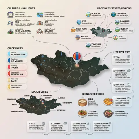
Ultra-clean modern country infographic poster (1080x1080), premium editorial layout meets lifestyle travel photography. Showcase Country as the hero visual in the center: a slightly angled 3D map cutout / glossy paper-cut map silhouette with subtle shadow, with a small flag pin marker on the capital city. Add a soft natural studio lighting feel, gentle gradient + minimal texture background for an upscale magazine look. Around the hero map, arrange information like a recipe infographic—dynamic, floating panels and clusters, not restricted to top-down. Clear hierarchy: hero map > key stats badges > cities/provinces > culture/foods > tips. SECTION 1 — Quick Facts (clean glassmorphism badges near the hero): - Capital: CAPITAL - Population: POPULATION - Currency: CURRENCY - Language(s): LANGUAGES - Time zone: TIMEZONE - Best time to visit: BEST SEASON Display as modern rounded pills/bubbles with accent color highlights. SECTION 2 — Provinces/States/Regions (ingredients-style clusters): List NUMBER provinces/regions with mini icons/mini map segments or simple pictograms. Example: PROVINCE 1, PROVINCE 2, PROVINCE 3... Each item includes a small icon (mountains, river, desert, forest, coastline) and one short label (e.g., “coastal”, “historic”, “wine region”). Arrange in curved flows connected with thin lines to the map. SECTION 3 — Major Cities (connected pin points): Show 5–8 key cities with small pin markers on/near the map and clean labels: City 1, City 2, City 3... Use lines/arrows from labels to map pins, avoiding clutter. SECTION 4 — Signature Foods (recipe vibe): Show 4–6 famous foods of COUNTRY with small tasty mini illustrations or photo-style cutouts: Food 1, Food 2, Food 3... Add short descriptors (spicy, street food, dessert, grilled). Keep vibrant natural food colors. SECTION 5 — Culture & Highlights (editorial callouts): Include icons and 1-line notes for: - Famous festival: FESTIVAL - Traditional music/dance: CULTURE - Landmark(s): LANDMARKS - Nature highlight: NATURE Use clean vector icons and minimal text. SECTION 6 — Travel Tips (step-like numbered panels): Show 4–6 numbered “tips” panels arranged around the hero map with arrows showing flow: 1) Tip 1 2) Tip 2 3) Tip 3 Add small icons (plane, train, hotel, safety, budget, camera, SIM card). Use glassmorphism panels with soft gradients and subtle drop shadows. Typography & Style: Modern sans-serif typography, high readability, strong grid alignment, airy negative space, subtle shadows, crisp vector icons, accent color palette inspired by COUNTRY flag (tasteful, not overwhelming). Editorial, premium, ultra-clean, social-feed optimized. Output requirements: Ultra-crisp, no watermark, no logo, no extra text beyond the provided labels, balanced spacing, high contrast readability, 1080×1080.

durs.ai
Industrial X-Ray Transparency Product Render
3DPhoto

Industrial X-Ray Transparency Product Render

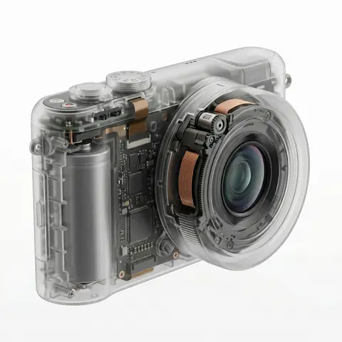
visual_style_analysis_v2: style_definition: name: Industrial X-Ray Transparency Render, core_aesthetic: Minimalist, Futuristic, Clinical Precision, Structural Functionalism , visual_logic: Exploded view aesthetics within a closed shell , color_system: palette_type: Monochromatic Grayscale with Metallic Accents, background: #F5F5F5 to #FFFFFF (Clean Studio White), foreground: outer_shell: Frosted Translucent White/Grey, inner_components_primary: Matte Black/Dark Graphite, inner_components_secondary: Metallic Silver/Copper, highlights: Soft Specular Highlights , internal_component_architecture: description: Hierarchy of internal parts to create realistic density, layer_1_structure_skeleton: elements: Injection molding ribs, screw bosses, mounting brackets, visual_role: Defines the shape and adds ghostly lines inside the shell , layer_2_power_drive: elements: Cylindrical/Pouch Batteries, Copper Coils, Transformers, Magnets, visual_role: Provides visual weight and dense black masses , layer_3_logic_control: elements: Printed Circuit Boards (PCB), Solder points, Silicon Chips, Ribbon Cables, visual_role: Adds intricate, fine detail and technical texture , layer_4_interface: elements: Tactile switches, USB-C ports, LED indicators, haptic motors, visual_role: Connects the inside to the outside surface , lighting_and_atmosphere: lighting_type: Backlit Clinical Studio, characteristics: Transmissive Glow, Rim Lighting to define edges, Soft Ambient Occlusion inside , materials_and_textures: shell_material: Frosted Polycarbonate (PC) with 85% opacity, internal_finish: Matte vs Glossy contrast (components are glossy, shell is matte), x_ray_effect: Depth-based opacity (thicker parts look darker) , demonstration_example: product_type: Pro Game Controller / Precision Tool, prompt_application: Show rumble motors (weights), battery pack in center, ribbon cables connecting triggers, complex PCB under buttons , ai_prompt_keywords_suggestion: X-ray render, translucent frosted shell, visible internal engineering, layered internal components, complex circuitry, copper coils and batteries, structural ribbing, C4D octane render, industrial exploded view, schematic realism

durs.ai
NOVA Pure Sound Wireless Earbuds Premium Ad
PosterPhoto

NOVA Pure Sound Wireless Earbuds Premium Ad

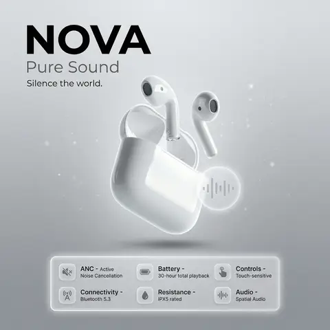
prompt: brand: <b>NOVA</b>, title: Pure Sound, tagline: Silence the world., visual_style: composition: minimalist product ad, Apple-style premium aesthetic, background: soft gray gradient with subtle noise texture, ambient light particles or micro-gradient overlays to gently fill negative space without clutter, lighting: high-end studio lighting, soft rim light, gentle catchlights, negative_space: balanced asymmetry with subtle decorative elements (soft gradient orbs, faint geometric lines) to occupy empty areas while preserving clean minimalism , product: name: NOVA Pure Sound Wireless Earbuds, specifications: finish: matte black anodized aluminum, design: ergonomic in-ear fit, seamless unibody construction, features: Active Noise Cancellation (ANC), Bluetooth 5.3 connectivity, 30-hour battery life with charging case, IPX5 water resistance, Touch-sensitive controls, Spatial audio support , dimensions: Earbud: 2.1g each | Case: 45g , placement: centered, floating slightly above surface with subtle drop shadow , specifications_ui: container_style: glass morphism panel, icon_style: effect: frosted glass blur (14px), soft white border glow, subtle inner shadow for depth, background: rgba(255,255,255,0.1) with backdrop-filter blur, layout: icons arranged in a responsive grid beneath product, evenly spaced with gentle hover elevation , specs: icon: 🔇, label: ANC, value: Active Noise Cancellation, tooltip: Block out distractions, immerse in pure sound , icon: 📡, label: Connectivity, value: Bluetooth 5.3, tooltip: Stable, low-latency wireless connection , icon: 🔋, label: Battery, value: 30-hour total playback, tooltip: All-day power with compact charging case , icon: 💧, label: Resistance, value: IPX5 rated, tooltip: Sweat and splash resistant for active lifestyles , icon: 👆, label: Controls, value: Touch-sensitive, tooltip: Intuitive gestures for music, calls, and voice assistant , icon: 🔊, label: Audio, value: Spatial Audio, tooltip: Immersive 3D soundstage with dynamic head tracking , ui_elements: accent_icon: style: glass morphism, description: translucent frosted-glass icon with subtle blur, soft white border glow, floating near product, symbol: abstract soundwave or minimalist earbud silhouette, effect: background blur: 12px, opacity: 0.85, inner shadow for depth , typography: brand_font: bold, ultra-clean sans-serif (e.g., SF Pro Display Bold), body_font: light weight, high legibility, color: charcoal black / soft white contrast, hierarchy: brand prominent, tagline subtle, specs clean and scannable , mood: premium, serene, technologically sophisticated, output_format: ultra-high-resolution, 4K, photorealistic render with shallow depth of field
durs.ai
Corporate Income Statement Sankey Diagram
AdvertisementPhoto

Corporate Income Statement Sankey Diagram

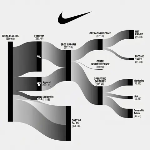
Subject: A professional financial Sankey diagram visualizing the Income Statement of a major corporation, in the style of App Economy Insights and US corporate financial reports.Visual Style: High-fidelity vector infographic, clean minimalist aesthetic, flat design. The background is a clean, very light grey or off-white.Color Strategy - CRITICAL: Analyze the Insert Brand Name Here logo. Extract its primary brand color (e.g., if Nvidia use neon green, if Meta use blue, if Tesla use red). Use this primary color as the dominant theme for the main revenue flows and profit blocks. Create a harmonious color palette based on this primary color: use saturated shades for the vertical nodes (bars) and semi-transparent, lighter opacity gradients for the flowing paths to ensure a cohesive and professional look. Avoid clashing colors.Composition & Structure: Flow: A horizontal flow from Left (Revenue Sources) to Right (Net Profit). Texture: The connecting paths (flows) must appear silky smooth with elegant Bezier curves, looking like liquid ribbons, not jagged lines. Iconography: On the left side (Revenue sources), include specific, minimalist flat vector icons representing the business segments (e.g., a car icon for automotive, a cloud icon for services, a chip icon for hardware). Branding: Place the official Insert Brand Name Here logo clearly at the top center or near the central revenue bar.Details: High resolution, 4k, sharp typography (sans-serif), professional data visualization layout. The chart clearly distinguishes between Revenue, Gross Profit, Operating Expenses, and Net Profit.

durs.ai
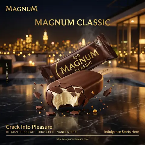
Magnum Classic Dark Chocolate Rooftop Night Cinematic FMCG Poster
PosterPhoto

Magnum Classic Dark Chocolate Rooftop Night Cinematic FMCG Poster

Hyper-realistic professional FMCG ice cream commercial ad poster. Magnum Classic in dark chocolate brown featuring dual composition: one sealed Magnum wrapper and one bitten ice cream bar, arranged on a polished black marble surface. Background: a luxurious night-time rooftop setting overlooking a blurred city skyline with golden lights bokeh, evoking exclusivity and indulgence. Cool night air with subtle drifting mist. The sealed pack positioned slightly behind at a refined angle, gold branding catching ambient city light. The opened Magnum bar in front with a bite taken out, chocolate shell cracking dramatically revealing creamy vanilla core. The product hyper-detailed — sharp chocolate fracture edges catching warm golden highlights, molten interior texture visible, slight melting at edges, reflection visible on marble surface below. Floating micro chocolate shards suspended mid-air. Composition: bitten bar dominates foreground, packaging secondary, cinematic negative space blending into city lights. Typography: top left — Magnum logo gold. center — “MAGNUM CLASSIC”. bottom left — “Crack Into Pleasure”. below — “BELGIAN CHOCOLATE · THICK SHELL · VANILLA CORE”. bottom right — “Indulgence Starts Here”. thin separator. bottom center — “http://magnumicecream.co m left vertical — “CLASSIC · 2026”. Lighting: mixed lighting — soft city glow + warm rim light enhancing chocolate gloss, deep cinematic contrast. Mood: sensual, luxurious, late-night indulgence. Shot on ARRI Alexa Mini LF, 100mm macro, shallow DOF, HDR, ultra photorealistic, cinematic FMCG poster, 4:5 portrait.

durs.ai